  © 2024 borui. All rights reserved.

  This content may be freely reproduced, displayed, modified, or distributed with proper attribution to borui and a link to the article:

  borui(2024-02-29 22:43:26 +0000). networkx graph visualization tips. https://borui/blog/2024-02-29-en-networkx-graph-visualization-tips.
@misc{
  borui2024,
  author = {borui},
  title = {networkx graph visualization tips},
  year = {2024},
  publisher = {borui's blog},
  journal = {borui's blog},
  url={https://borui/blog/2024-02-29-en-networkx-graph-visualization-tips}
}
built-in layout choices
The default layout is spring layout, here are some common layouts:
the built-in layouts demo
# libraries
import pandas as pd
import numpy as np
import networkx as nx
import matplotlib.pyplot as plt

# Build a dataframe with your connections
df = pd.DataFrame({ 'from':['A', 'B', 'C','A','E','F','E','G','G','D','F'], 'to':['D', 'A', 'E','C','A','F','G','D','B','G','C']})

# Build your graph
G=nx.from_pandas_edgelist(df, 'from', 'to')

# Circular
nx.draw(G, with_labels=True, node_size=1500, node_color="skyblue", pos=nx.circular_layout(G))
plt.title("circular")
plt.show()

# Spring
nx.draw(G, with_labels=True, node_size=1500, node_color="skyblue", pos=nx.spring_layout(G))
plt.title("spring")
plt.show()
custom layout
the draw api
draw(G, pos=None, ax=None, **kwds): Draw the graph as a simple representation with no node labels or edge labels and using the full Matplotlib figure area and no axis labels by default. See draw_networkx() for more full-featured drawing that allows title, axis labels etc.
Parameters:
G: A networkx graph.
pos: A dictionary with nodes as keys and positions as values. If not specified a spring layout positioning will be computed. See networkx.drawing.layout for functions that compute node positions.
ax: Draw the graph in specified Matplotlib axes.
kwds: See networkx.draw_networkx() for a description of optional keywords.
From the above documentation, we can know that the output of function
nx.spring_layout(G) in nx.draw(G, with_labels=True, node_size=1500, node_color="skyblue", pos=nx.spring_layout(G))
is to generate a dict based on the graph object G.
-
One customization we can to is to implement our own customized position generation function with input of a networkx graph.
-
Another customization we can do is to create Matplotlib axes, I will explain this below, begining with what is Matplotlib axes
Matplotlib axes
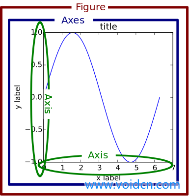
Basically in matplotlib, Axes defines a drawable area where we can plot on.
Trough axes we can set the position of the area on the final output plot, and also we can set margins and other attributes of the area.
Subplot is the default form of a axes.

An example
Add padding to NetworkX graph in MatPlotLib
I want to render a networkx graph with matplotlib. The labels are somewhat long (around 10 - 50 characters each) and they tend to get cut off, preventing me from being able to read them. Is there a way I can make matplotlib "zoom out" the final rendering a bit so I can read all the text?
Creating an axis and setting a margin on that did the trick:
ax1 = plt.subplot(111)
ax1.margins(0.3)

nx.draw(
  G,
  ax=ax1,
  with_labels=True,
  font_size=8,
  node_color='white',
)
reference
-
Mohit Mayank. (Jan 26, 2021). Visualizing Networks in Python [Blog post]. Towards Data Science. Retrieved from https://towardsdatascience.com/visualizing-networks-in-python-d70f4cbeb259
-
禹洋搬运工. (Nov 19, 2018). python matplotlib中axes与axis的区别是什么? 1.axes subplot axis 先说第一个疑惑 Axes - Subplot - Axis 之间到底是个什么关系? 因为我是努力在看英文的教程,所以刚开始对axes和axis是基本搞不清的,一个是轴的复数,一个是轴,好像设定图像属性的时候经常用axes,具体到某个坐标轴的时候才会用axis。然后教程还说,subplot和axes基本就是一个意思。真是坑坑坑。。。 扛不住,翻了翻中文教程,好像有的教程就直接把axes翻译成子图了,好像这个世界就压根没有subplot和axes的区别。。看了半天,其实我还是觉得axes翻译成轴域比较贴切,下面就结合后来看到的各种教程来讲讲自己最后的理解。. [Answer]. zhihu. https://www.zhihu.com/question/51745620/answer/231113561
-
咕咕小虎. (April 4, 2018). 第一已经回答得很清楚了,我也被这个恶心过,说一种更好理解的方式。可以把fig想象成windows的桌面,你可以有好几个桌面。然后axes就是桌面上的图标,subplot也是图标,他们的区别在:axes是自由摆放的图标,甚至可以相互重叠,而subplot是“自动对齐到网格”。但他们本质上都是图标,也就是说subplot内部其实也是调用的axes,只不过规范了各个axes的排列罢了。. [Answer]. zhihu. https://www.zhihu.com/question/51745620/answer/373278296
-
Jesse Aldridge. (Mar 29, 2021). Creating an axis and setting a margin on that did the trick: ax1 = plt.subplot(111)ax1.margins(0.3)nx.draw(G,ax=ax1,with_labels=True,font_size=8,node_color='white',). [Answer]. stackoverflow. https://stackoverflow.com/questions/66862622/add-padding-to-networkx-graph-in-matplotlib/66863072#66863072
-
Version3.2.1>Reference>Drawing>draw (n.d.). networkx documentation. Retrieved April 5, 2024, from https://networkx.org/documentation/stable/reference/generated/networkx.drawing.nx_pylab.draw.html#draw https://networkx.org/documentation/stable/reference/generated/networkx.drawing.nx_pylab.draw.html#draw
-
v3.8.4-2-g4dcfcf8b7b>API Reference>matplotlib.pyplot>matplotlib.pyplot.subplot(n.d.). matplotlib documentation. Retrieved April 5, 2024, from https://matplotlib.org/stable/api/_as_gen/matplotlib.pyplot.subplot.html#matplotlib-pyplot-subplot
-
Network Layout Possibilities(n.d.). python graph gallery. Retrieved April 5, 2024, from https://python-graph-gallery.com/322-network-layout-possibilities/